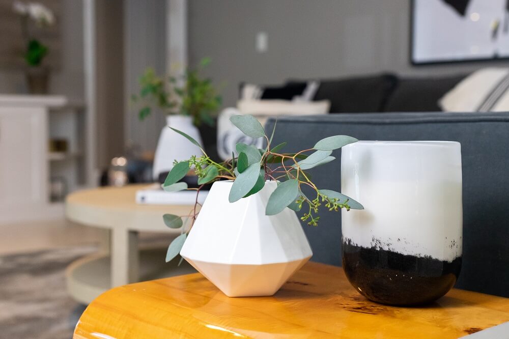
A Polished Living Room Design: The Design & Planning Process
Here is the first blog in our three day series. We are excited to share one of our latest projects – this sophisticated living room design.
We first met with these clients early this year to learn more about the project they were planning to start in the spring of 2018. It’s a young family of four with two lovely children ages 4 and soon to be 2. Their wish was to totally revamp their living room for a more modern and sophisticated look.
Nina has a great sense of style and we were excited to take on this project. The only piece of furniture that really had to stay was the sofa. Its design is simple with clean lines and the fabric is a super soft velvety fabric in a deep shade of grey. While the owner would eventually like to switch it out, we all agreed that it would work great in the room for now. We suggested to soften it up and break up the grey with new pillows and some throws. By not spending money on a new sofa, we were able to allocate the budget to purchasing some quality pieces that should last the family a long time. The client wanted to install a built in media unit in the room to house the electronics, add extra storage as well as provide a small workspace.
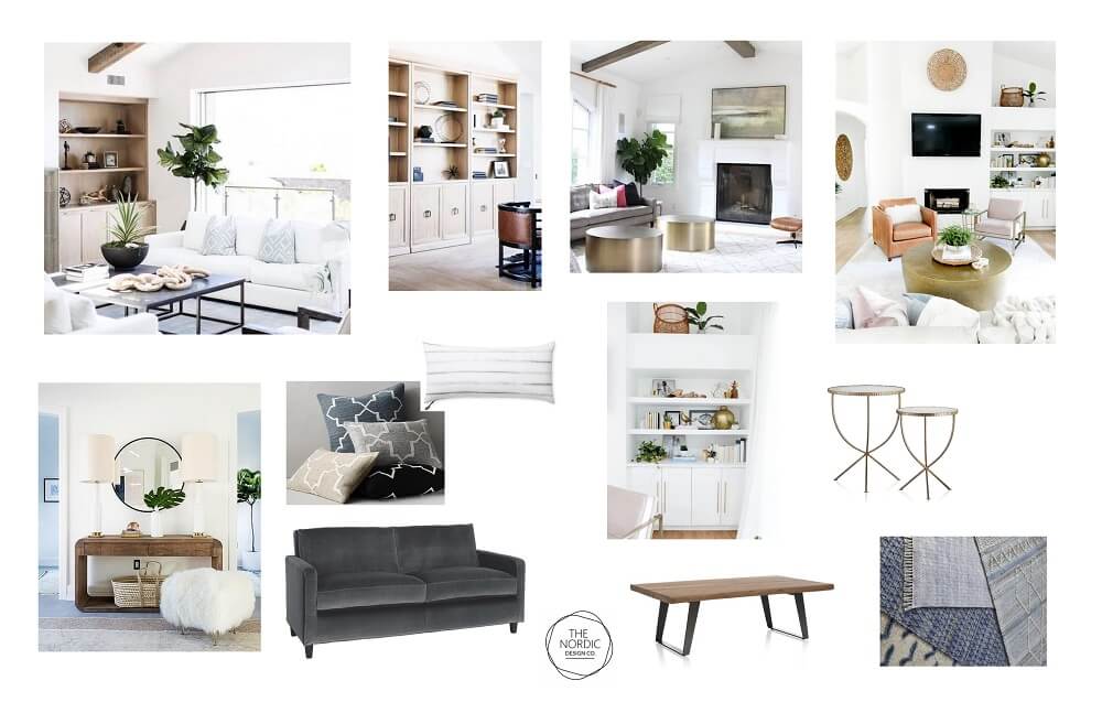
Here are some of the mood boards that we created for this living room design project:
The initial board had more of an “earthy” look to it:
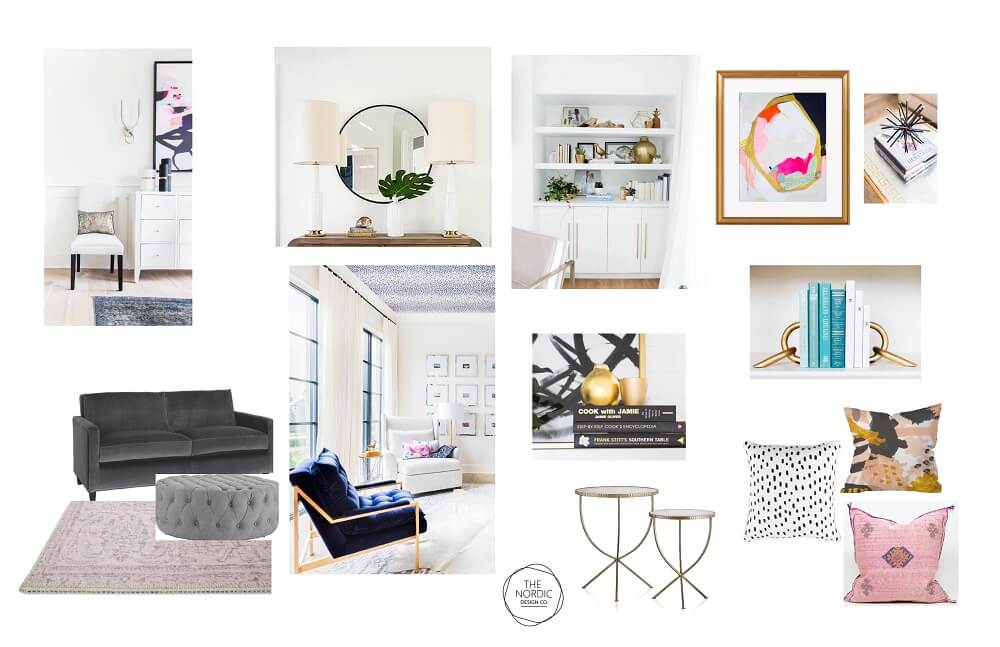
Then it transitioned to a more glamourous look with a hint of pink and dark navy:
In the end, we settled for a blend of both, keeping the elegant style but using a more neutral and restrained color scheme.
Lastly, here is the concept board which we used to pull together the actual items that were going into the room.
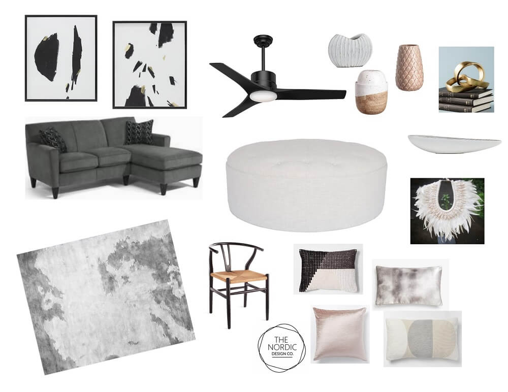
At first the design concept centered around this luxurious cream white tufted ottoman. It was the perfect mix of modern and traditional and the homeowners absolutely loved it. It was soft for the kids and just made the room feel so warm and inviting. We were all in love with this ottoman!
However, it was also a huge commitment since the white fabric was not removable or very forgiving as far as stains go. We all cried a small tear as we realized it would probably not be functional for a family with small kids. While we were trying to create a place where they could kick their feet up and relax, a white ottoman could turn into a stressful nightmare for an already busy mother.
Luckily for us, the homeowners fell in love with this lovely shagreen coffee table instead and we could all wipe our tears away.
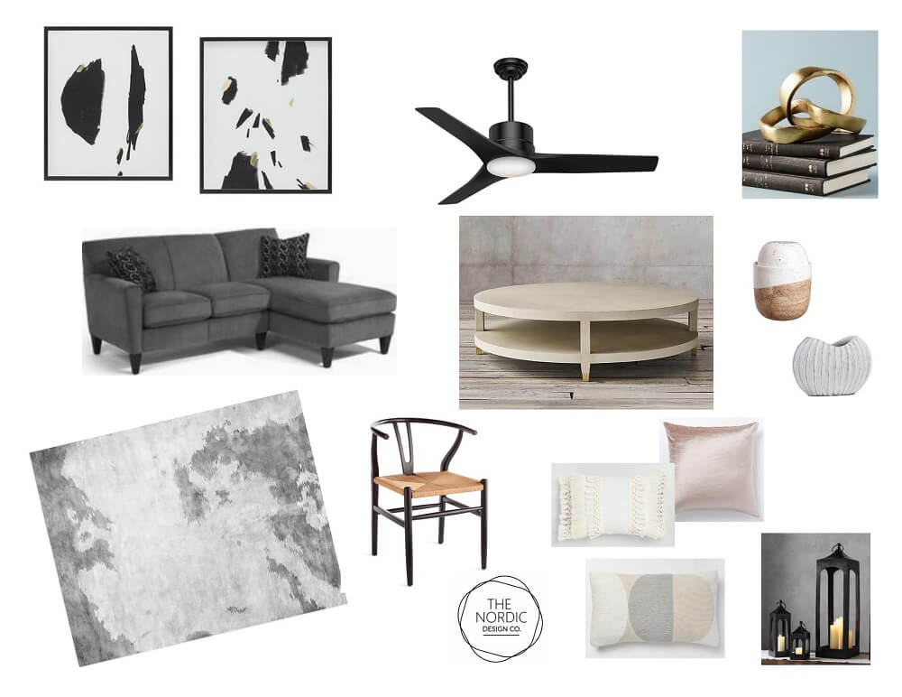
We added a black fan, rather than silver, for a little more attitude and a huge grey rug that is as comfortable as it is stylish. Then we started to work on the art for the room. We searched for a long time before settling on these two large framed pieces. The room called for something with scale and with a touch of white to contrast against the soft grey walls. Sometimes when we are out sourcing furniture, we get lucky and come across the right piece of décor and that is how we found this piece of art. In person the frames look black but they have white on the inside, which adds extra crispness and dimension to the piece. The hint of gold was just the right amount of sparkle we wanted for this room.
Then it was time for the accessories. While we generally like to show the homeowners some accessories up front, in the end, we like to bring in a ton of options and play around with them until the space feels right. We try to balance function with style and it’s a really fun process.
The desk chair added a sculptural element in the room, while also bringing in some natural materials that help to ground the space. Adding a picture to the nook behind the workspace allowed for it to look pretty when not used for work.
Stay tuned tomorrow for the design reveal…


